
We have a hypothesis: visual learning based on evidenced principles will radically improve learning over the next 10 years.
The SEND achievement gap is large and growing for many age groups. Some have argued that the SEND crisis is leading to a ‘lost generation’ and school curricula aren’t sufficiently accessible to all students.
At Chalk we believe that you can teach anything to anyone, as long as the learning is designed accessibly. As teachers, we also know that it takes a lot of time to design learning materials accessibly. We agree with Pep’s McCrea’s call for learning to be ‘accessible by default’ and chalk is positioned to enable teachers to do this. A recent steplab video also showed that some of the best teachers in the country judiciously utilise visuals based on learning science to power learning.
As a teacher for five years, I found using structured visuals to be a superpower for supporting all students, but especially those with additional needs. This is why we’ve built Chalk. Using Chalk radically reduces the time to create high quality visual and accessible learning materials backed by learning science. We believe designing visual learning provides the high-support and high-challenge curriculum needed to raise standards and reduce the SEND achievement gap.
What does Chalk do?
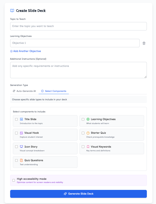
The Chalk platform reduces the time it takes to create evidence-backed visual learning materials. It is also a community of educators who want to push the boundaries to design high quality learning. Users are able to create storyboards, graphic organisers, videos, maps and visual-related tasks (such as Frayer and Hexagon exercises). Typically these activities take time to create because they involve complex formatting and design. Users have reported reducing the time it took for them to create a storyboard from 50 minutes to 4 minutes.
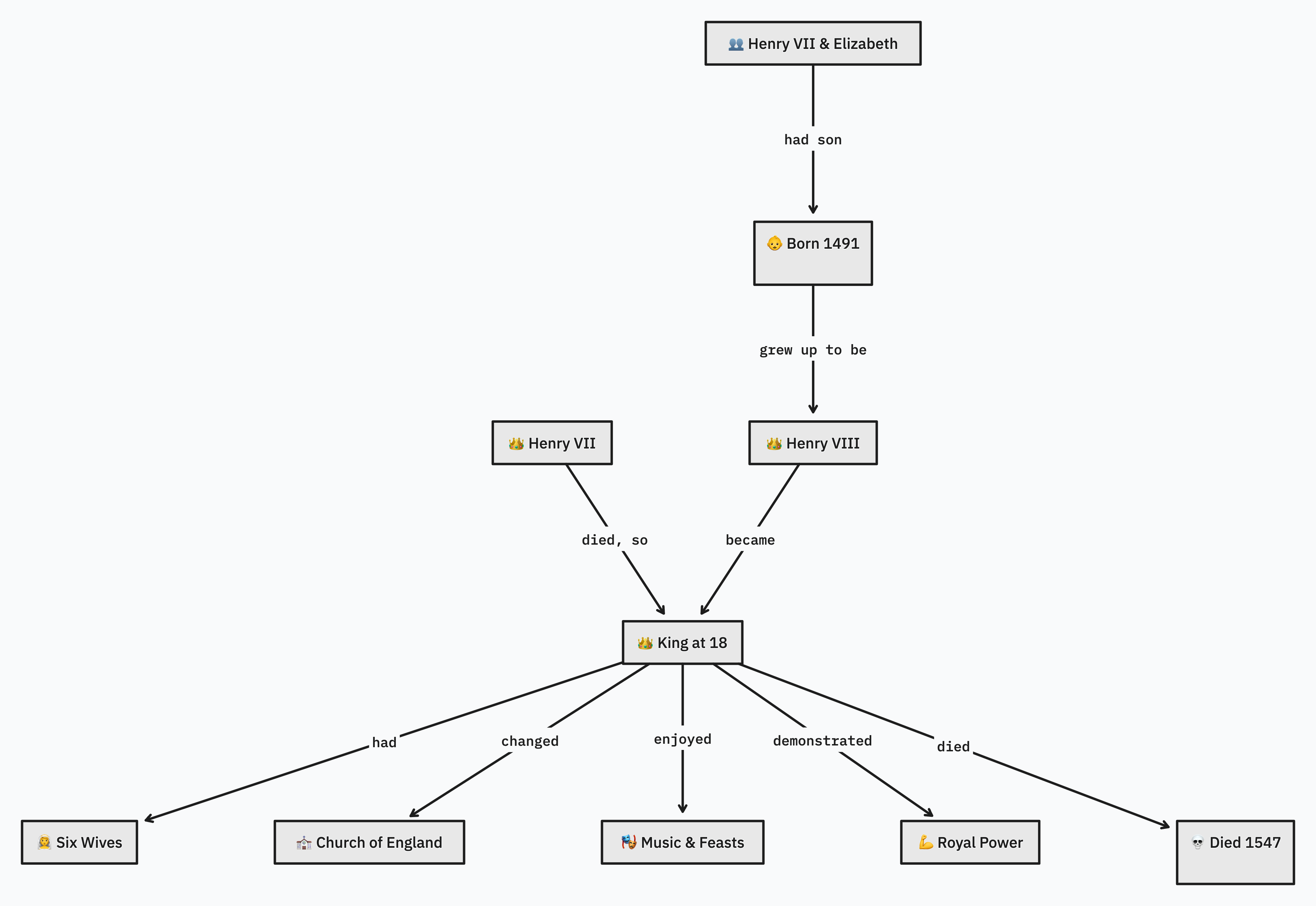
With chalk I can instantly turn this slide:
Into this slide:
As one science teacher commented: ‘The detail level control is absolutely brilliant - haven't seen anything like that before. Makes differentiated resources a breeze rather than the normal slog.’
I can then turn it into a high accessibility storyboard, video, or another educational diagrams.


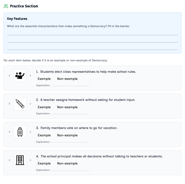
I can instantly make student-ready materials like a Hexagons worksheet:

Frayer Model worksheet:
. Characteristics Movement of water, Happens through a semi- permeable membrane osmosis Examples A raisin getting plump when soaked in water. Plant roots absorbing water from the soil. Non-Examples Sugar dissolving in water. Water flowing down α waterfall.\"")
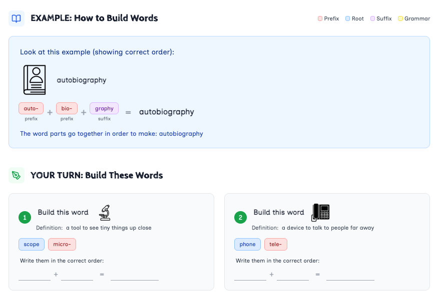
Visual Word Building activities:
And generate entire visual slide decks which makes using evidence-based visual learning principles less time consuming:
Why visual learning?
A large body of evidence demonstrates that well-designed visual materials can transform the ability for all students to learn, and especially those with additional needs.
Richard Mayer has produced the most comprehensive set of research (60 research studies across 20 articles) on the impact of visual learning. One of his most significant findings is what he terms the "multimedia effect" - the principle that students learn more deeply from words and pictures together than from words alone. This effect is remarkably consistent across various learning contexts:
Mayer and colleagues conducted 11 experimental tests examining this principle, with every single comparison demonstrating better transfer and retention performance for students who received words and pictures rather than words alone. The median effect size across these studies on transfer was an impressive 1.39, indicating a very large practical benefit.
This robust effect has been demonstrated across various learning materials including Computer-based explanations of how pumps work, How brakes function, How lightning storms develop, Paper-based explanations with text and illustrations and Game-based explanations of mathematical concepts.
Beyond the basic multimedia effect, Mayer's research has identified several principles with substantial effect sizes:
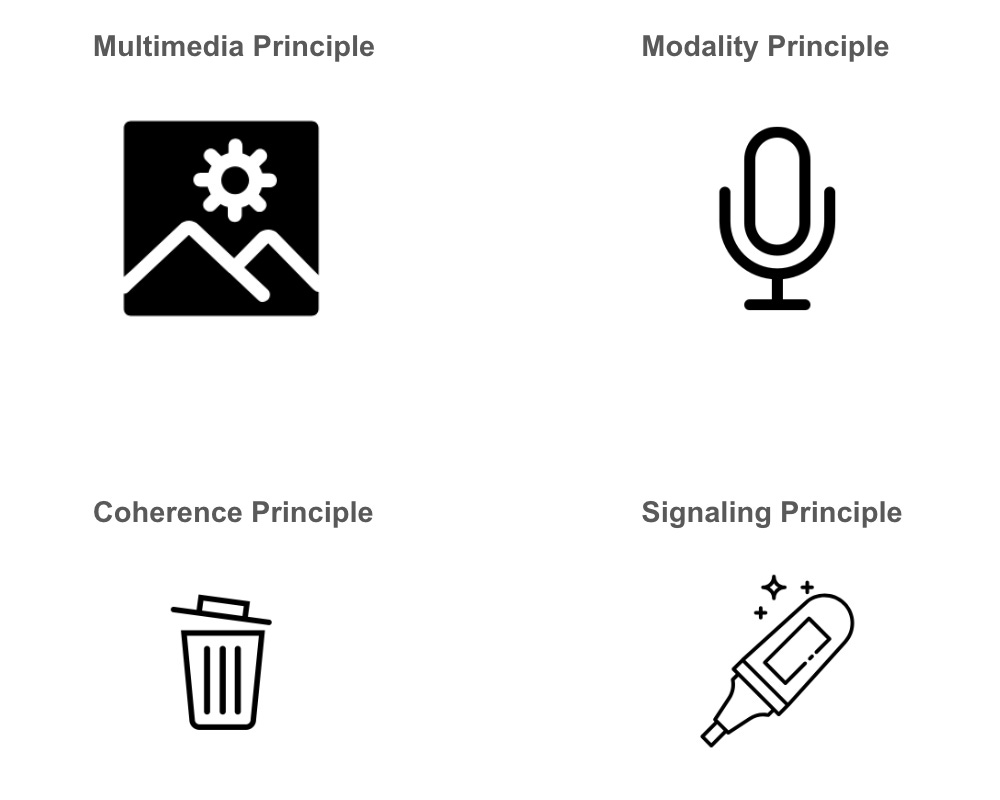
1. Spatial Contiguity Effect: When printed words are placed near corresponding graphics rather than separated, learning improves significantly (median effect size of 1.12 across 5 studies). This is particularly important for learners who may struggle with working memory.
2. Temporal Contiguity Effect: When corresponding narration and animation are presented simultaneously rather than successively, learning outcomes improve dramatically (median effect size of 1.30 across 8 studies).
3. Coherence Effect: Eliminating extraneous words, pictures, and sounds enhances learning (median effect size of 1.11 across 11 studies). This is especially crucial for students with attention difficulties.
4. Modality Effect: Students learn better from animation and narration than from animation and on-screen text (median effect size of 1.13 across 12 studies).
Made with Chalk, using Noun Project icons.
How does this inform chalk?
We enable teachers to make learning materials where:
1. Learning materials include both words and appropriately designed visuals
2. Text is integrated spatially near relevant visuals
3. Narration and animation are synchronised
4. Extraneous material is removed
5. Verbal information is presented through audio when accompanying animations
6. Component concepts are taught before complex systems
7. Material is presented in a conversational style
8. Essential information is clearly signalled
What are the theoretical foundations?
As well as the empirical research above, there are also theoretical reasons why visual learning works so well.
Firstly, high quality design of learning reduces cognitive load. Mayer calls this the ‘limited capacity assumption’.
Secondly, visual learning leverages our powerful ability to process via verbal and visual Channels at the same time. This was called ‘dual coding’ by Paivio and Mayer calls it the ‘dual channel assumption’.
Thirdly, there is evidence that the way humans think, as Barbara Tversky has put it ‘is fundamentally spatial’. This is also pointed to by the spatial nature of our conceptual language, including most of the metaphors we use (see George Lakoff for more on this).
lastly, visual learning allows us to better support active processing of information. Mayer calls this the ‘active processing assumption’, and it includes ensuring the learning is meaningful so students actively have to organise, link and pay attention to key information. Organising information is a key component of Ausubel’s Meaningful learning (see Sarah Cottinghatt) while Dan Willingham noted the importance of explicitly linking knowledge for students in a recent book. Oliver Caviglioli and co-authors have laid a lot of the intellectual groundwork about why organising learning is so important1 while Adam Boxer and George Duoblys have fleshed out what this means for science as a discipline.
We believe the education system relies too heavily on unformatted text. Given the overwhelming evidence provided above about how to design knowledge visually to optimise learning, it’s surprising how common it is to narrate over text or creating busy slides and worksheets which disperse cognitive load. The rise of LLMs threatens to make this situation worse. AI education tools are very good at producing lots of high quality but unformatted text.
Over the past 10 years there has been a revolution in classrooms where evidence-based approaches, from spaced retrieval to reducing cognitive load, have become mainstream. We think the next step on the evidence-based education journey involves designing for powerful visual learning.2
What teachers are saying
Teachers at over 550 schools across the UK, Australia, US and Canada are already using chalk to make high quality visual materials. One primary school teacher said that creating graphic organisers with chalk had transformed his teaching: "This is massively helpful for kids. I can tell you straight away."
We have SENCOs who have visualised their EHCP process to bring visual clarity and alignment between parents, staff and students and Senior Leaders who are visualising their behaviour and attendance policies to bring more alignment to their organisations.
See more examples of diagrams our users have made here:
Get Involved
Try the tool here and sign up to this substack for updates. If you’re interested in diagrams and high quality visual learning please get in touch.
We have partnered with 3 MATs, the Tutor Trust and multiple schools. We are supported by expert advisors, Sarah Cottinghatt and Karl McGrath. If you’d like to partner, would like a group discount for your school / MAT or have any questions please get in touch at phil@chalklearning.io
There is a long history of diagrams being used to demonstrate relationships, from the Mandala, the integrative philosophy of Korean Neo Confucians in the 15th century to the tree diagrams of the Middle Ages and the network diagrams used to explain the internet today.
for clarity, this doesn’t mean we’re should focus any less on reading - as this is a critical tool - in fact designing information right can support reading too.
I'm really interested in this, I am a leader and science teacher at a special secondary school for autistic learners. As such a focus on “visuals” for SEN tends to take you into widget world…. Which has some application, but doesn't address the overall good graphics/visual design of teaching materials.
I’m a big follower of @olicav. Oliver Caviglioli so I'm really interested to explore your platforms capabilities.
I make lots of what I call “desk diagrams” for science that I print on card, then cut up. When introducing a topic I assemble the diagram under my visualloer, then get student to do the same with my example showing as a guide. Then we scrambled it all up take away the example and get the students to re assemble the diagram again. Then onto some practice work activity/worksheet etc. then rebuild again at the end of the lesson.
. Next lesson get them to reassemble from memory… dynamically removing parts, and getting students to draw /write missing parts in whiteboard pen on the desk. Over a sequence of spaced practice the end aim is that students draw the diagram themselves… with the scaffolding dynamically available for those who cannot master to that level, or for whom writing /drawing is difficult.
I'm hoping this platform would make putting these together much easier!